Amongst the vast number of things that appear different are quite a number of Labels. Bear in mind that according to official history, these companies have not changed their logos, they have always been this way according to them. It certainly makes for a lot of crazy making, at least until you’re familiar with the Mandela Effect. I will run through some examples here.

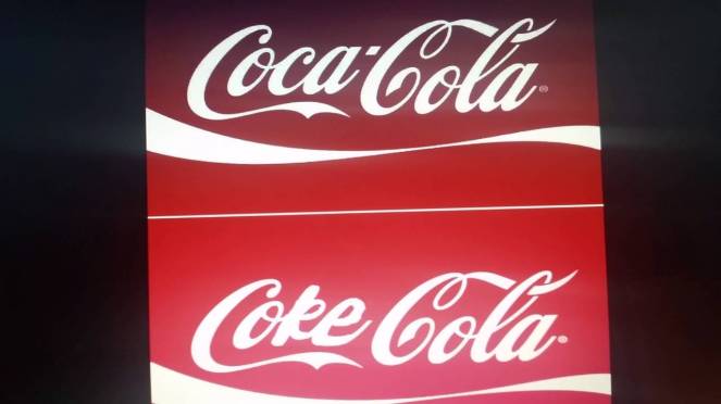
The top image is the current official logo, the bottom one has an alternative spelling. Obviously the person who recreated the bottom one remembers things differently than either the top example or my memory. This discrepancy can be accounted for if this brand exists in multiple universes and the logo being a little different in each. I remember it being the alternative spelling, but also it being written ‘Coke-Cola’ with a hyphen.

Anyone else remember the hyphen, I certainly do, again, the company has NOT changed their logo in this timeline, it has never had a hyphen here.

Yes guys, this is another one. McDonalds has NEVER had a name change, and yet many people clearly remember this above picture, this is the only picture of the old sign that I was able to find. I highly doubt that a well recognized multinational company has misspelled it’s own name on one or two restaurants, they would have these signs manufactured in bulk and ship them to where they’re needed when they need to replace a broken sign or whenever they open a new restaurant..

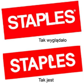
The poster says it all. This change is so subtle I never noticed it until it was pointed out to me, but yes, the arrow on the S is new, but has apparently always been here.

Do you remember Febreeze in the 90s? I do, but the product never existed, it’s always been Febreze. Which of these bottles looks right to you?

Which one do you remember? I don’t recall the L ever being anything other than a normal L, and this is the kind of thing I would normally notice and question.

Which of these looks right? Did you realize that Ford had that squiggle that is part of the F? Look above the O in the top image, and then compare it to the bottom image. This edit seems pretty recent to me, I’d never seen it before a couple of weeks ago, but then I wasn’t looking for it.

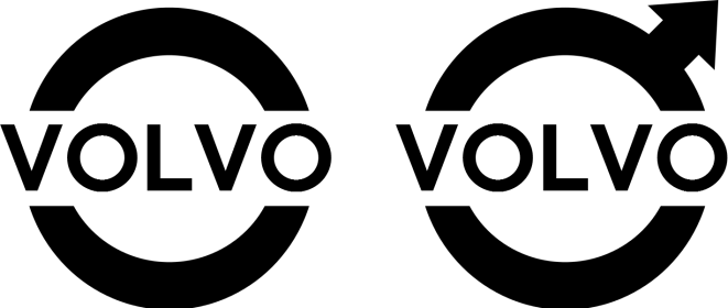
Again, which one is right? I’d always known Volvo to just be the name and the circle, the arrow wasn’t there, and yet the arrow has always been there.
Those are just a small fraction of the logos that have undergone Mandela Effect changes. There are many many more, but these are sufficient to show you the type of alterations that people are noticing.
LETS KEEP SOME PERSPECTIVE – How do we know when it’s a genuine Mandela Effect?
Although many things are changing due to the Mandela Effect, let’s not label any and all changes you see as Mandela Effects, sometimes it genuinely isn’t. For instance, recently Pepsi updated it’s logo.

The right hand image is the new logo. However, it is still easy to find the old logo, and Pepsi have openly acknowledged that they’ve changed the logo. Clearly this change has nothing to do with the Mandela Effect and is simply a company updating it’s logo for it’s product.
We can be absolutely sure it is a Mandela Effect when the following are true:
- The company denies ever changing it’s logo, claiming that it was that way from the beginning.
- A large number of people remember it being different, and agree on what that difference was.
- Over time it becomes more and more difficult to find the unaltered image, to such a degree that they may need to be reconstructed by those who remember it differently. (alternate reality ‘residue’ like this disappears over time).
It’s a good way to sort out the genuine phenomenon from normal everyday changes that companies make from time to time.
